
Architecture intérieure
Design global
Réconcilier design et performance pour vos espaces
NOTRE MÉTHODOLOGIE POUR ALLIER DESIGN ET PERFORMANCE DE VOS POINTS DE VENTE.
Avec notre méthodologie spécifique, dédiée aux opérations de retail (sur les secteurs Mode, Gourmet, Beauté, Maison, Parc à Thèmes), nous vous proposons un accompagnement global, pour répondre de manière adaptée à vos besoins :

1.
L’imprégnation
Audit et décorticage de l’offre in store et web, du point de vue de votre client.

2.
La segmentation
Passage au tamis pour révéler les « pépites » de la marque de l’offre et des services

3.
La révélation
Ranger la maison : l’organisation de l’offre et du parcours client

4.
La création
Mise en œuvre d’une démarche de Design Global

5.
La formation
UNIQ LAB Formation : une étape complémentaire, à destination de vos équipes sur le terrain.
My Uniq Studio est ainsi à vos côtés de A à Z, depuis l’audit de l’existant jusqu’au pilotage de la phase opérationnelle : passation des marchés avec les prestataires (AMO DCE et appels d’offres), suivi des travaux jusqu’à la réception de votre chantier.
Nous intervenons depuis l’échelle d’une boutique jusqu’à l’ensemble de votre réseau.
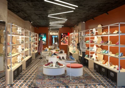
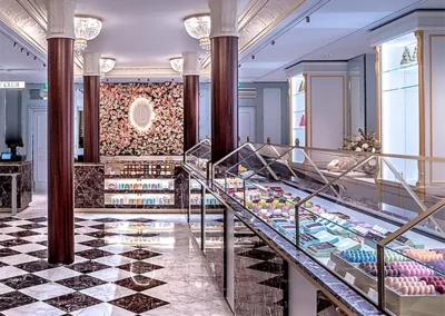
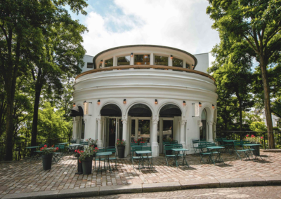
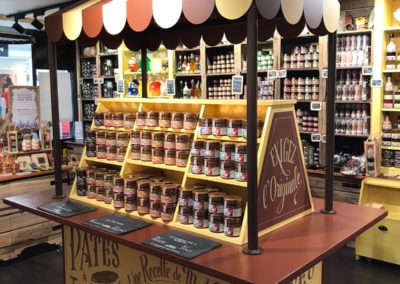
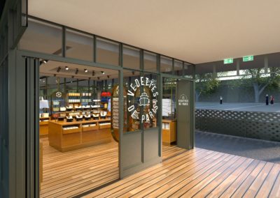
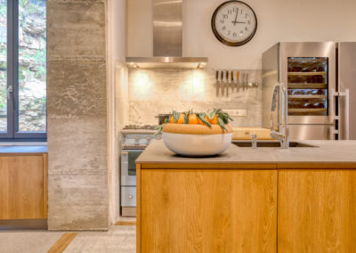
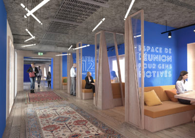
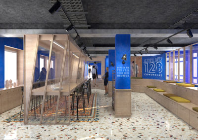
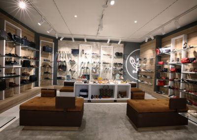
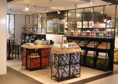
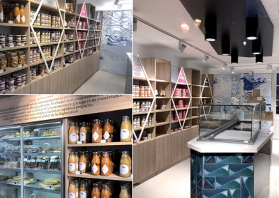
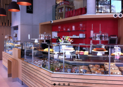
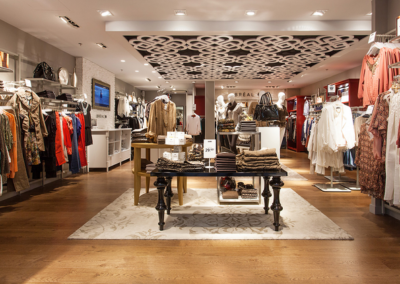
Réalisations

Expertises
design global
Chez My Uniq Studio nous considérons que le design est un facteur de performance pour votre entreprise, à condition que la conception des espaces soit centrée sur l’expérience de l’utilisateur final.
Nous vous apportons conseil et accompagnement pour vos projets de design global, d’espaces commerciaux, d’espaces de travail et d’hospitality.
Sur chacune de nos missions nous intervenons dans une approche globale, en alliant la créativité et la compétence technique.
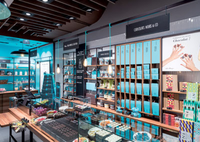
Notre expérience significative dans le secteur du Retail permet de réconcilier le design et la rentabilité des points de vente. Nous vous proposons ainsi le développement de concepts de boutiques clés en main, signalétique et communication in store, design d’identité et packaging.
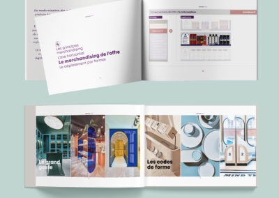
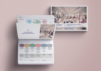
marketing de l’offre
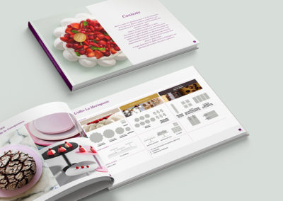
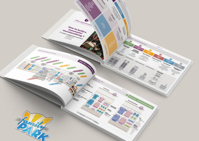
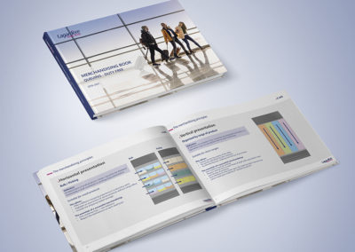
Les équipes de My Uniq Studio allient de manière unique le design et la performance du point de vente, au travers d’une méthodologie robuste qui met en son centre l’analyse de l’offre proposée au sein de l’espace de vente.
Notre approche se base sur un audit du point de vente (physique ou digital) en privilégiant la vision client, pour votre parcours comme pour votre organisation de l’offre.
Nous analysons et définissons une stratégie dédiée à votre boutique, comprenant l’identification d’une nouvelle segmentation de l’offre proposée et des recommandations d’évolution de votre mix produits, tout en capitalisant sur vos spécificités, votre positionnement et vos objectifs.
Nous garantissons une augmentation de votre CA à deux chiffres, consolidée dès la première année.
formation
Le sur-mesure fait partie de notre ADN et nos formations s’inscrivent dans le prolongement de nos prestations d’experts, dans l’expérience client et le merchandising.
En participant à ces ateliers sur mesure, vos collaborateurs bénéficieront d’une formation unique qui prend en compte vos enjeux et l’ensemble des spécificités de votre organisation.
Chaque client et chaque mission est unique : notre analyse et nos recommandations le sont également.
Équipe
My Uniq Studio c’est à la fois une équipe spécialisée dans le design global et un collectif d’experts reconnus.
Nous étudions votre projet et nous mettons à votre service une équipe sur mesure, disposant de toutes les compétences et expériences requises pour sa bonne réalisation.

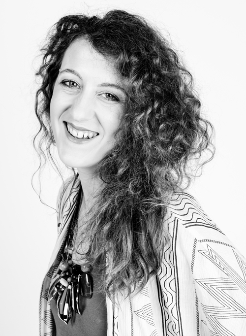
Valérie Hudelot, Fondatrice
ARCHITECTE D’INTÉRIEUR, MARKETING DE L’OFFRE, CONSEIL ET FORMATION
Fabienne Marteau
DIRECTRICE DE CRÉATION
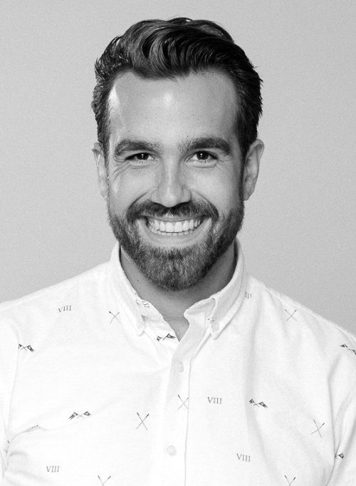
Maxime Lemaitre
DIRECTEUR DE CLIENTÈLE / DESIGNER D’ESPACES
Clients


![]()
Tél. 06 85 27 12 02
©MyUniq Studio 2024 - Mentions légales - Politique de confidentialité - Site web réalisé par Sandrine Tyteca/Designer graphiste